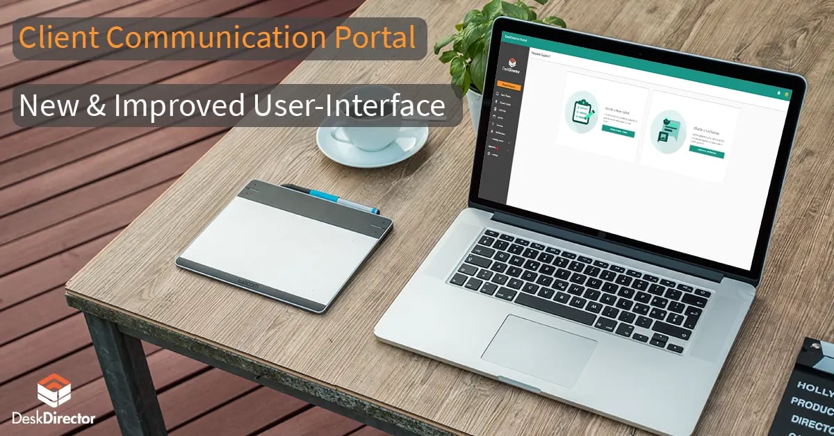
We are pleased to announce that our improved portal UI is ready to go! We made a huge interface revamp to the main request support page.
In this article, we introduce you to the new and improved request support page of our client communications portal, explain what’s changed from the current design and what benefits you get from it. Let’s dive in!
What does it look like?
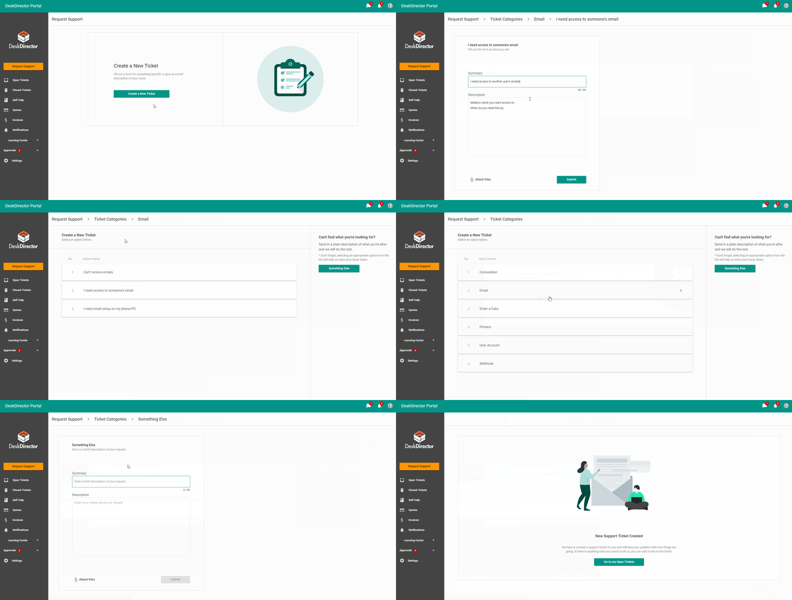
(!) Colors and branding are customizable. You can use white or black background – whatever suits your branding. The service catalog should speak to your customer's needs, e.g. if they have frequent requests for new users, it should be there in catalog.
Pro tip: Make the choices limited to avoid confusion.
What have we improved?
The client communication portal has only one aim - better customer experience. The better the experience, the better adoption rates.
Navigation that adds comfort
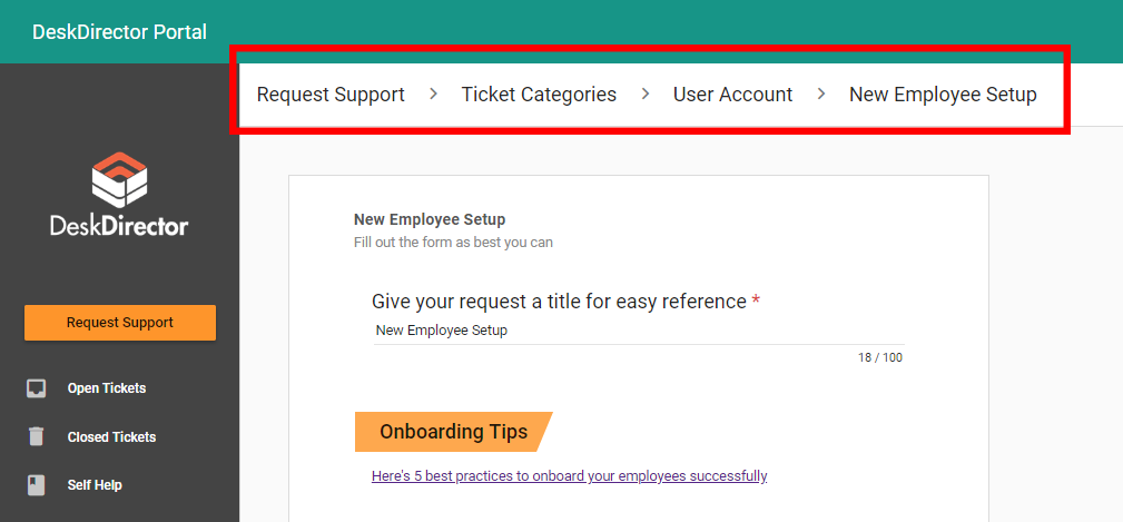
Knowing where you are in the app creates comfort and enhances user satisfaction. That is why we introduced a breadcrumb trail to the ticket creation process. People can see where they are and quickly navigate around the site without being confused.
Interface elements that give clear meaning
When they’re in the middle of a problem, people don’t want to guess what they need to click.
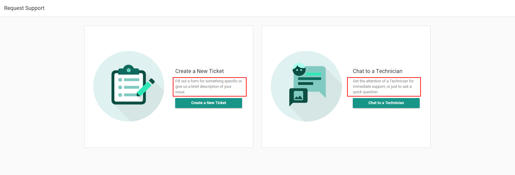
That is why we added a subtle but explicit description to key UI elements. This makes it very simple for the end user when they first use the platform, and helps them understand every button and function.
Intuitive design that saves time
Time is the most precious resource we have. The intuitive design structure makes it easier to recognize important information and achieve the desired outcome faster. If the customer has an issue, they want to resolve it fast, so they need to log a ticket within seconds!
Compare the current request support page with the new design below:
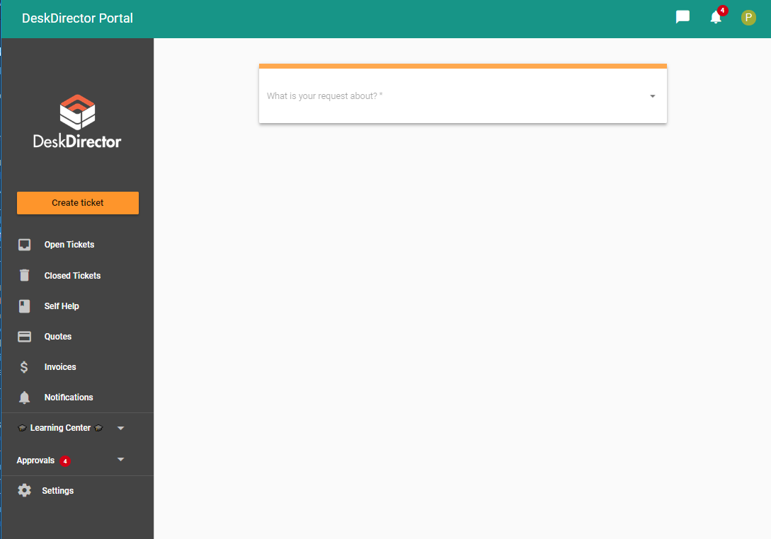
We discovered people got confused on the above screen. it looks empty and not very clear where they should click next. We listened carefully to feedback from our customers and made improvements accordingly :-)
The new request support page now looks like this:
We’ve changed the button on the left from "Create Ticket" to “Request Support”.
You can also present your customers with a chat option, so when your client fires up your the portal, they will be presented with different support options. It will look like this:
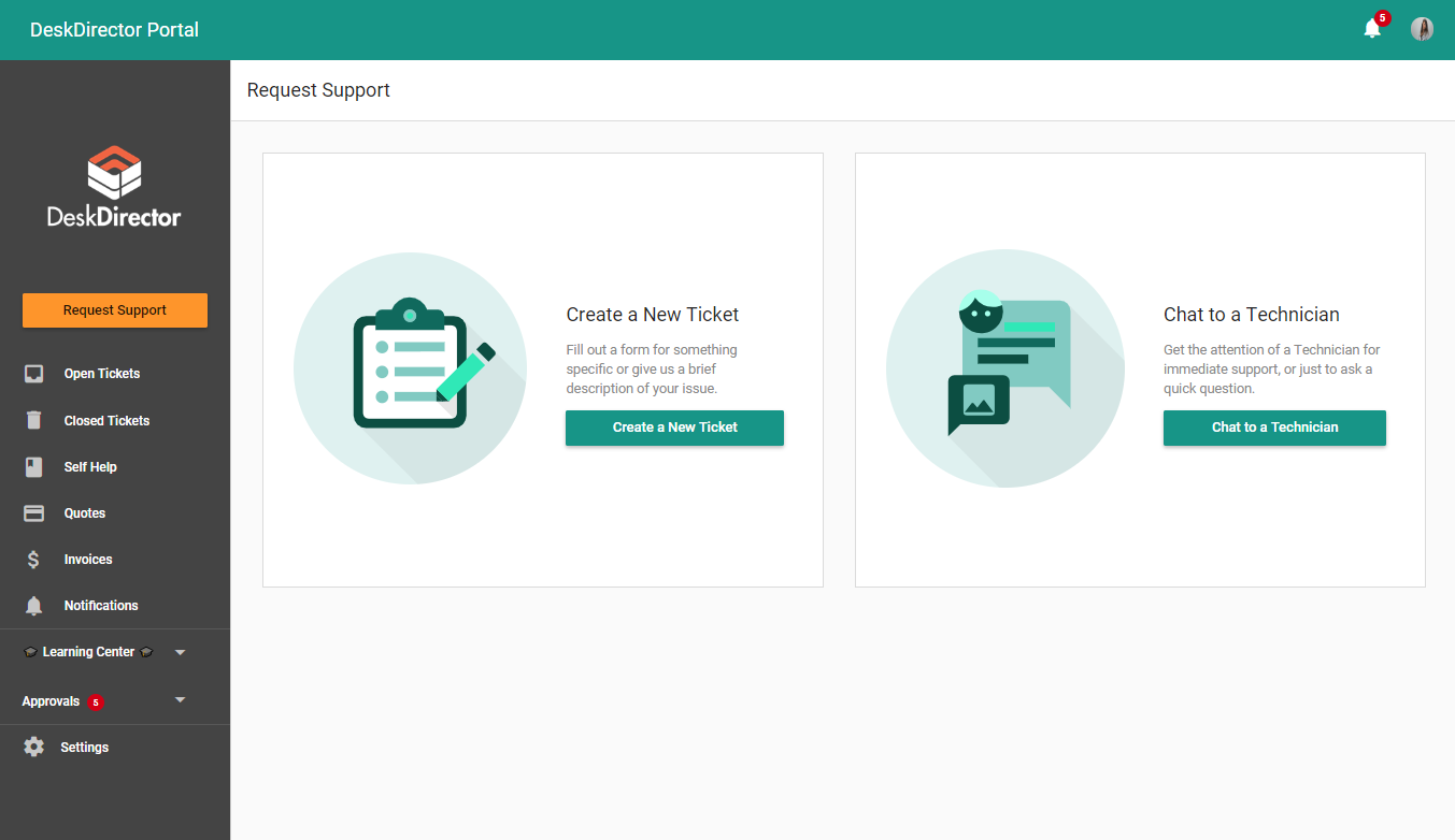
You can choose which companies or contacts can have the chat option. Please note, the chat feature is fully functional and you can give it to your clients, but it’s part of DD Tech, which is in open beta, available to all customers. (The official release will be later this year)
When they click "Create a New Ticket", they can immediately see the service catalog you specifically designed for them!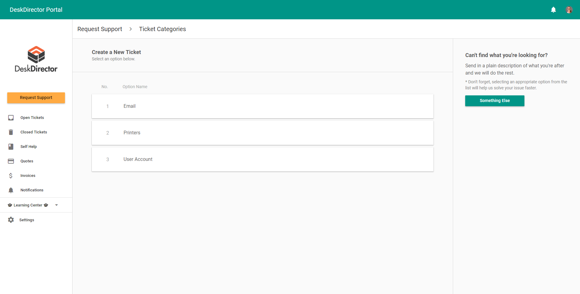
Intuitive design saves you time on educating your clients, it is so straightforward that you don’t need to spend much time explaining how to log a ticket.
Instead, you can make the portal it relevant for them, e.g. adding request types that speak to their needs or learning that covers their most common issues. You can even on-board them using the portal.
What’s your next step?
Get familiar with the new portal UI
Try our new demo - experience the demo as an end-user. You can also look at our features, which showcase all the abilities of the portal.
Improve your customer service by adopting the ultimate client portal – we start at $97 only. View our pricing.
See what other MSPs have to say
Hear what other MSPs have to say about the value we add to their help-desk team. Look into what your peers are doing and adopt the right practices for your MSP business.


