It is extremely important to us that your customers are enjoying DD portal and are willing to stick with it. Instead of using time-consuming telephone calls and error-prone email communication. If you have more clients using the portal the better it is for your business. You will spend less time on the phone and less time going back-and-forth using email.
That is why we listen to your feedback and continuously improve DeskDirector portal, so you have more of your customers using it every day. We are investing into the UI design to help you represent your MSP as an exceptional, first-class IT provider that cares about its clients. As well as creates experiences that bring value to the client’s business. This is also bringing multiple benefits to your MSP business. While your customers are having a far greater experience than before, it helps your bottom line by improving a wide range of metrics such as client satisfaction, loyalty, retention and productivity rates.
Today, we are pleased to announce that a new portal UI is ready to rock! We made a huge interface revamp to the main request support page.
In this article, I will introduce you to a new request support page, how it is better than our current design and what steps you need to take to roll it out to your clients. Let’s dive in!
What it looks like
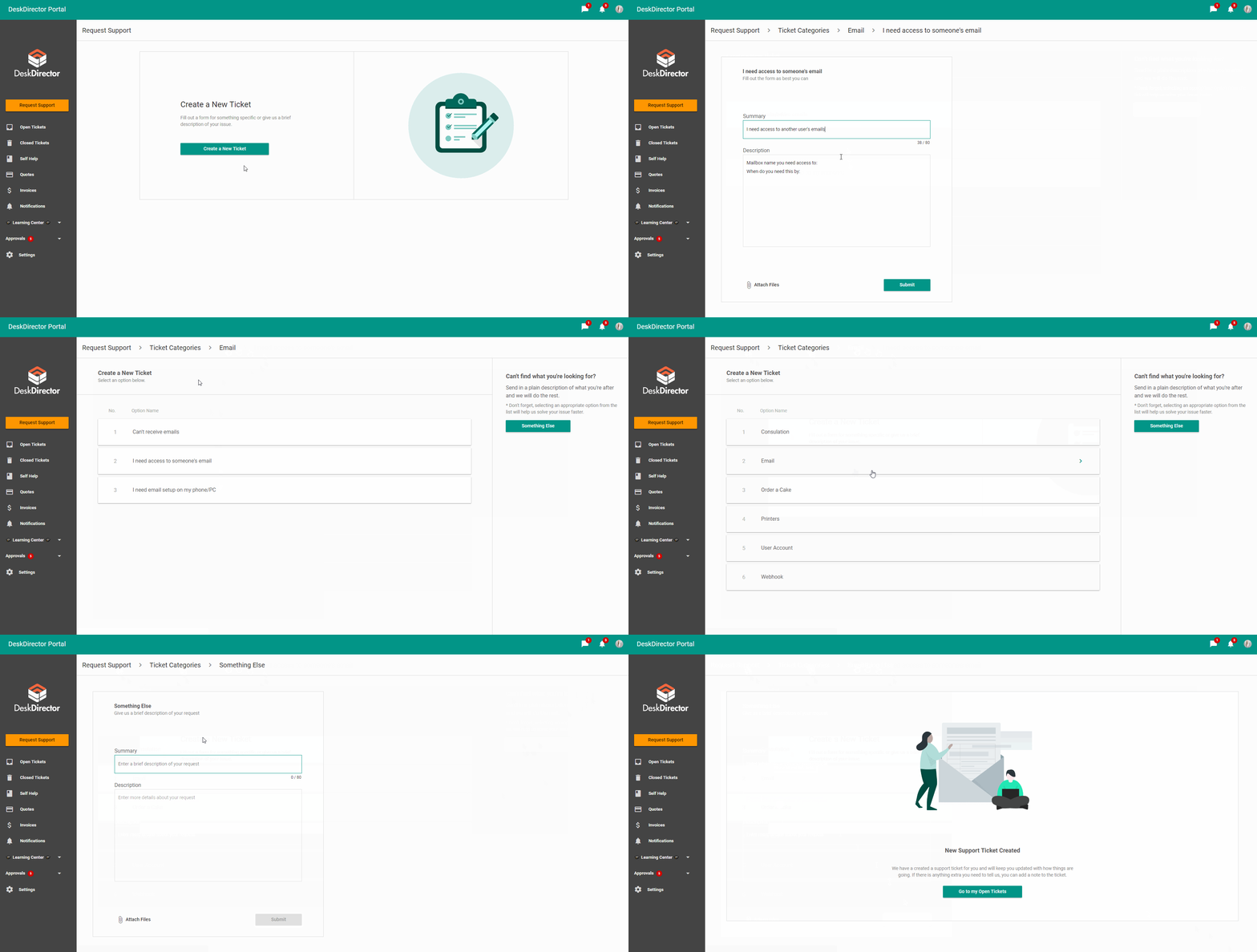
(!) Please note that colors and branding are customizable. You can use white or black background, whatever suits your branding. Service catalog should speak to your customer's needs, e.g. if they eat lots of cakes and constantly asking to order one, you should have it on the menu!
Our recommendation is to try and condense the amount of choices available on the ticket menu to avoid overwhelming your customers. An ideal goal is to ensure you have no more than five service options for your users to choose from. You should aim to add only what is the most relevant to them.
You can read our best practices on creating service catalog here.
Quick wins of a new portal design
A new portal UI includes quick wins such as:
Navigation that adds comfort
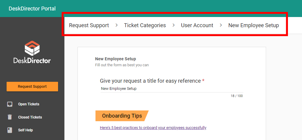
Knowing where you are in the app creates comfort and enhances user satisfaction. That is why we introduced a breadcrumbs trail to a ticket creation process. People can see where they are and quickly navigate around the site without being confused.
Interface elements that give clear meaning
People don’t want to guess what they need to click when they have a problem.
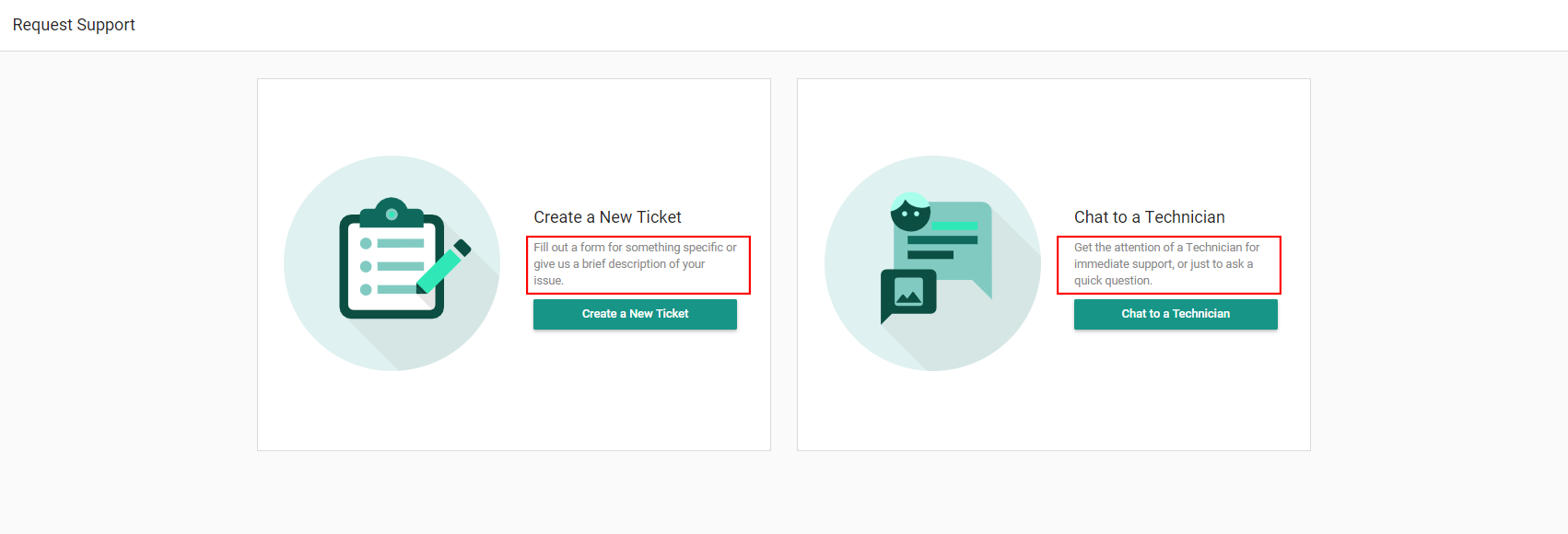
That is why we added a subtle but explicit description to key UI elements. This makes it very simple for the end user when they are the first time around and helps them understand every button and function.
Intuitive design that saves time
Time is the most precious resource we have. The intuitive design structure guides our eyes, making it easier to recognize important information and achieve the desired outcome faster. If they have an issue, they want to resolve it faster, so they need to log a ticket within seconds!
Compare current request support page with a new design below:
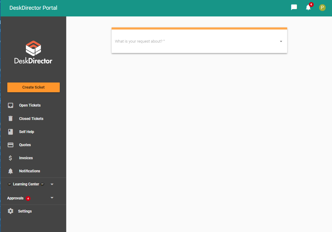
On the above screen people used to get confused, it looks empty and not very clear where they should click next. We got this feedback from our customers, we listened carefully and made improvements accordingly :-)
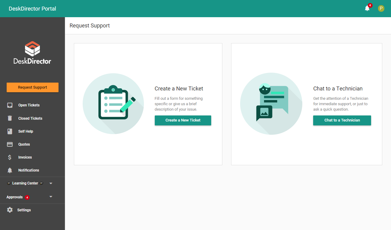
A new request support page looks like this now:
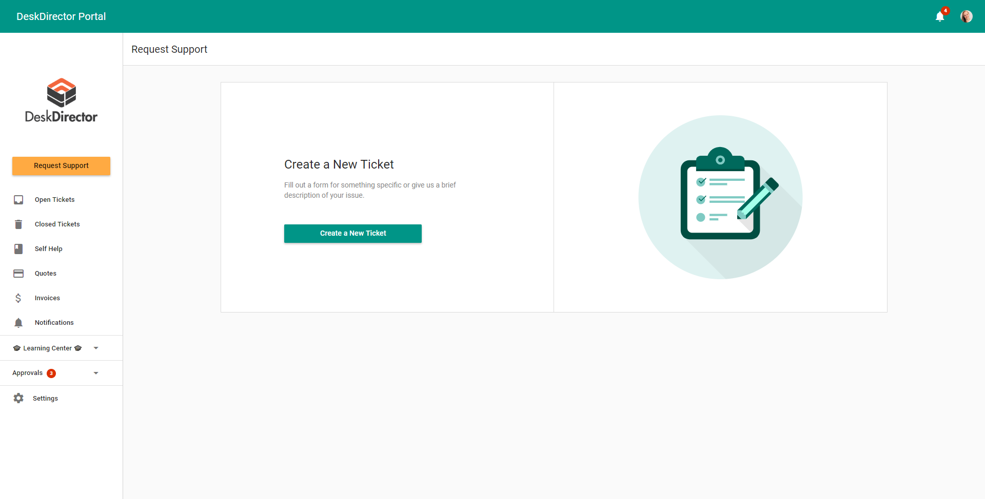
A button on the left is changed from "Create Ticket" to “Request Support”.
You can also present your customers with a chat option, so when your client fires up your the portal, they will be presented with different support options. It will look like this:
You can choose what companies or contacts can have a chat option. Please note, that chat feature is still in Beta. It is fully functional and you can give it to your clients, however, chat is a part of DD Tech system which is in the development process.
When they click "Create a New Ticket", they can immediately see your service catalog that you specifically designed for them!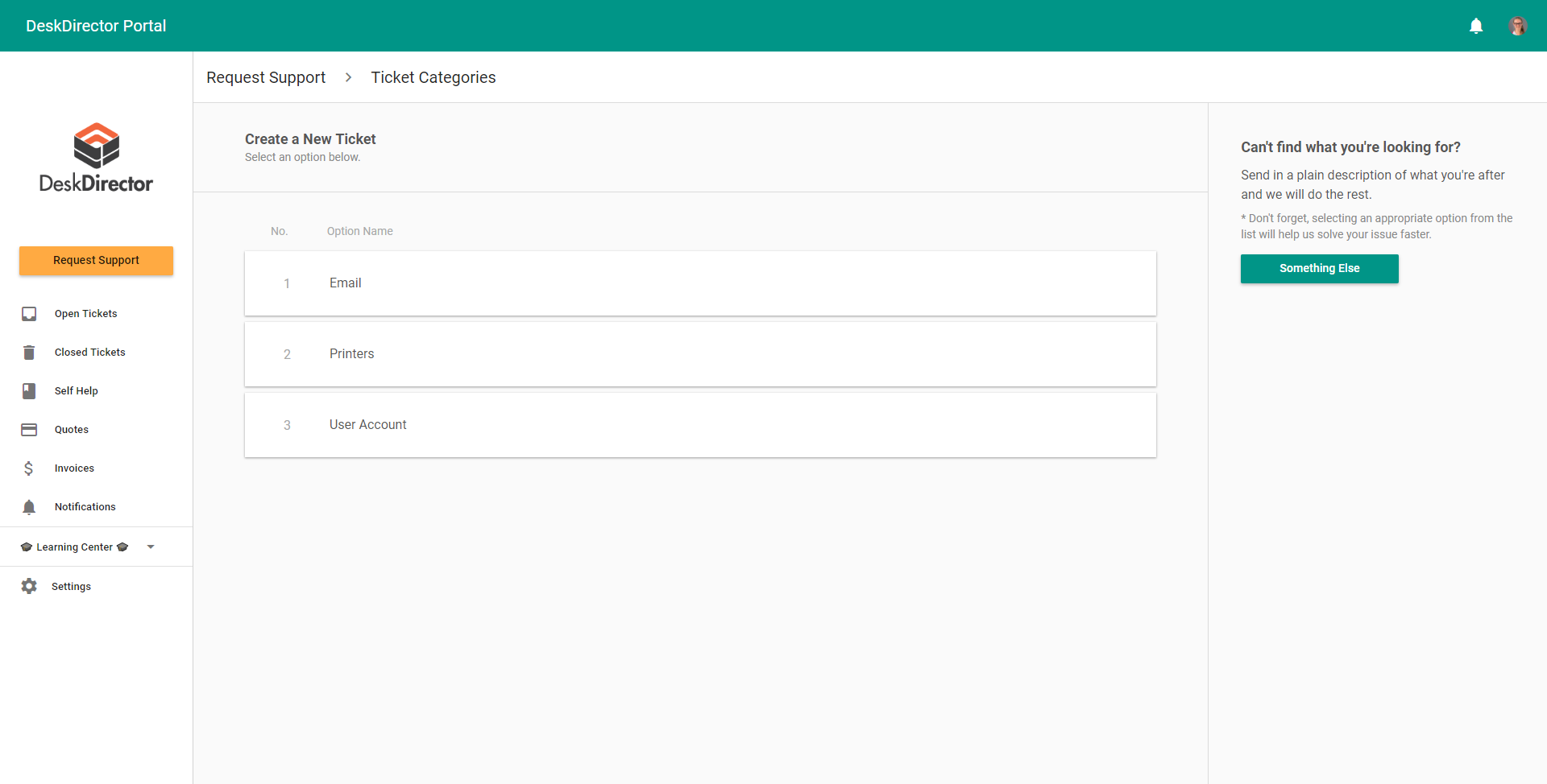
Intuitive design saves you time on educating your clients, it is so straightforward that you don’t need to spend much time explaining how to log a ticket.
Instead, you can spend more time making it relevant for them, e.g. adding request types that speak to their needs or adding learning that covers their most common issues!
What is your next step?
Get familiar with a new portal UI
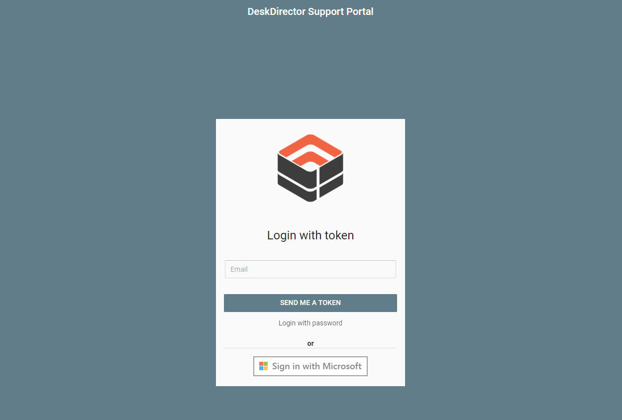
You should be using our DeskDirector Support Portal to view any new features and improvements. As well as log tickets to communicate with our support. Anyone from your team can log into the Support Portal via passwordless using company domain name.
Using DeskDirector Support Portal will help your team to learn the value it brings to your clients first-hand. It also contains Onboarding Center that will guide you on how to introduce DD Portal to your clients and increase portal consumption.
Create engaging presentation
We have prepared an editable PDF presentation that you can use to introduce a new portal interface to your clients. Use it as an opportunity to make it more relevant to your clients and re-introduce it with more value than before. You can download it here:
You can also find it inside your Onboarding Center (module three) along with other helpful content on how to onboard your customers.
Introduce to your customers
You have two options, you can either
- Let all your clients know that you are going to introduce a new portal interface that will look and feel even better on the [insert date].
- Test it out with a few customers first and see how they respond. This might help you to adjust your message to the rest of your clients.
In both cases, it is very important to explain why you are doing these improvements. We recommend comparing our current request support page with an improved version. This way you offer a solution to a current problem that your clients experience before. You want it to make easier and more pleasant for your clients to interact with your services and support. Why? Because you value your clients time.
Don’t forget to include a client guide to re-introduce it to them in a new light! You can also make a short video recording to make it more personal.
Enable a new portal interface
Check this knowledgebase article on how to enable a new portal design for all your clients or for a specific company.
If you have any questions about how to introduce it to your customers, please contact our customer success team.
A customer portal is a client facing application which is extremely important, as it is your brand representation. So, we take it seriously and won’t apply it without your permission.
You have a choice to turn it on when you are ready. However, at some point next year we will need to deprecate our old interface. This means that our new features and support will be built on top of the new UI. So, please keep that in mind and don’t postpone it for too long.


