DeskDirector Portal has been through many design iterations since its inception as a WPF app. In this article we will be taking a look at how our ticket input has evolved over the years.
WPF Windows Client
Our WPF app was released early 2013, and had most of the core functionality of most current app.
Here is a screenshot from version 15.6:
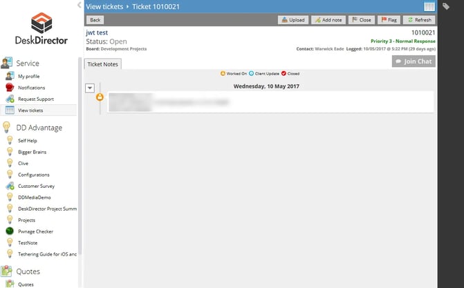
While this was an improvement over the ConnectWise portal at the time, it still had a few usability issues.
How do I reply to a ticket?
It was not immediately obvious where to reply to a ticket. The user had to locate and press the button labeled "Add note" in order to reply to a ticket. When pressed, the user would be prompted with this dialog:
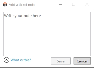
There are at least 3 things wrong with this design.
- It required 2 clicks just to get to the text field (the text field didn't automatically take focus). Once you had typed your message it took one more click to save the note. That's a whole lot of ceremony just to reply to someone on a ticket.
- The button was placed between the upload and close actions. Adding a note to a ticket is probably one of the most used actions, and yet it was drawing no attention to itself. There was nothing enticing the user to click on that button.
- The label "Add note" might make sense to techs and people in the industry, but to a normal user it doesn't scream "reply to the tech on this ticket"
Portal 1
Portal 1 started out as a web application. Its design was based on the WPF Windows Client, and as a result has carried over the same issues with replying to a ticket. Here's a screenshot of Portal 1 as it is now:
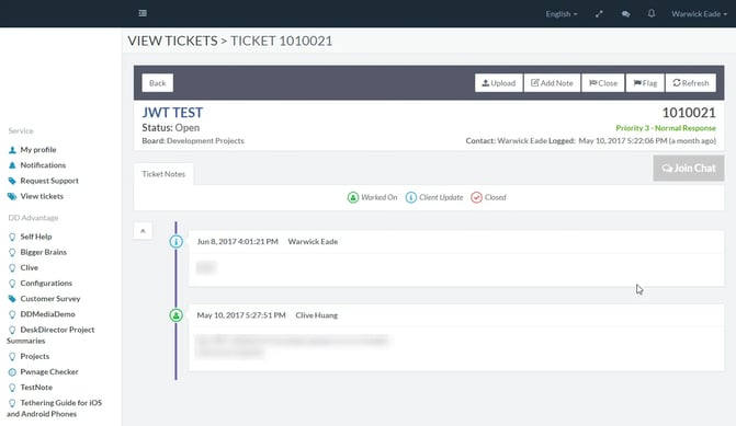
It does look a lot cleaner than the WPF version, but the problems with the add note button persist.
The biggest win for us by implementing Portal 1 was that we could write code once, and run it on Windows, OS X, and Web.
Portal 2 Alpha
Portal 2 was a huge shift for us. We completely rewrote the application using an implementation of Google's Material Design. Here's what the first version of the ticket screen looked like:
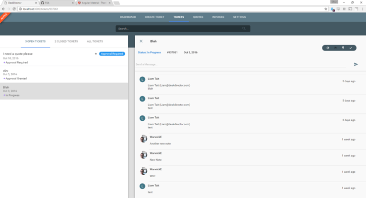
We think this was a huge step in the right direction. We completely removed the ceremony around adding a note, but there were still some problems.
The text field to enter a note didn't draw any attention to itself. The ticket actions (refresh, flag, FastTrack, close) grabbed the user's attention and appeared to be the primary way of interacting with a ticket.
The send button was disconnected from the text field, it was unclear exactly what it was associated with. It seemed like it might have some association with ticket actions (it didn't).
It was positioned inside of the ticket header, which didn't make much sense. When the user replied to a ticket, a note was added to the timeline below the header.
The enter key would immediately send the reply. While this is good functionality for a live chat, it was confusing some of our users who wanted to type paragraphs.
Portal 2
Portal 2 on release saw quite a few structural changes. Here's what it currently looks like:
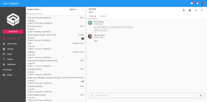
The ticket input now appears down the bottom of the screen, which strongly ties it with the ticket timeline.
The send button appears inside of the input, there are no longer any doubts as to what this button does.
The enter key will add a line break and will not immediately send a half written message.
The input takes focus as soon as the ticket is opened so you can type a message and send it with one click.
The ticket input features an additional button which will open a menu to access ticket actions. We have had a few discussions around this and, while convenient, we're not convinced that this was the right decision for a few reasons:
- Ticket actions aren't associated with replying to a ticket
- The icon doesn't reflect the types of actions that are hidden behind it. Users would expect actions more along the lines of "add image" or "upload file" rather than "FastTrack" or "Flag".
- More clicks to do simple actions like upload a file
The ticket input as it is now is the best it has been yet. However, there are even more improvements we can make and will be making in the weeks to come.


