We've been a bit quiet on our sprint updates, but we're going to be bringing them back again. You can check out the release notes for the previous couple of sprints to get an idea of what's changed.
Here’s a breakdown of what we've focused on in Sprint #5:
- Ability for end users to switch between accounts within the Portal
- Menu system now supports embedding a notebook (for those who use OneNote integration)
- Released a Microsoft Flow integration for all Dynamic users
- Portal Ticket Note Adjustments
- Improvements to search
- Better summary editing in Portal
- Improve new Tickets UI responsiveness
- product fixes
Let’s dive into the details.
Features
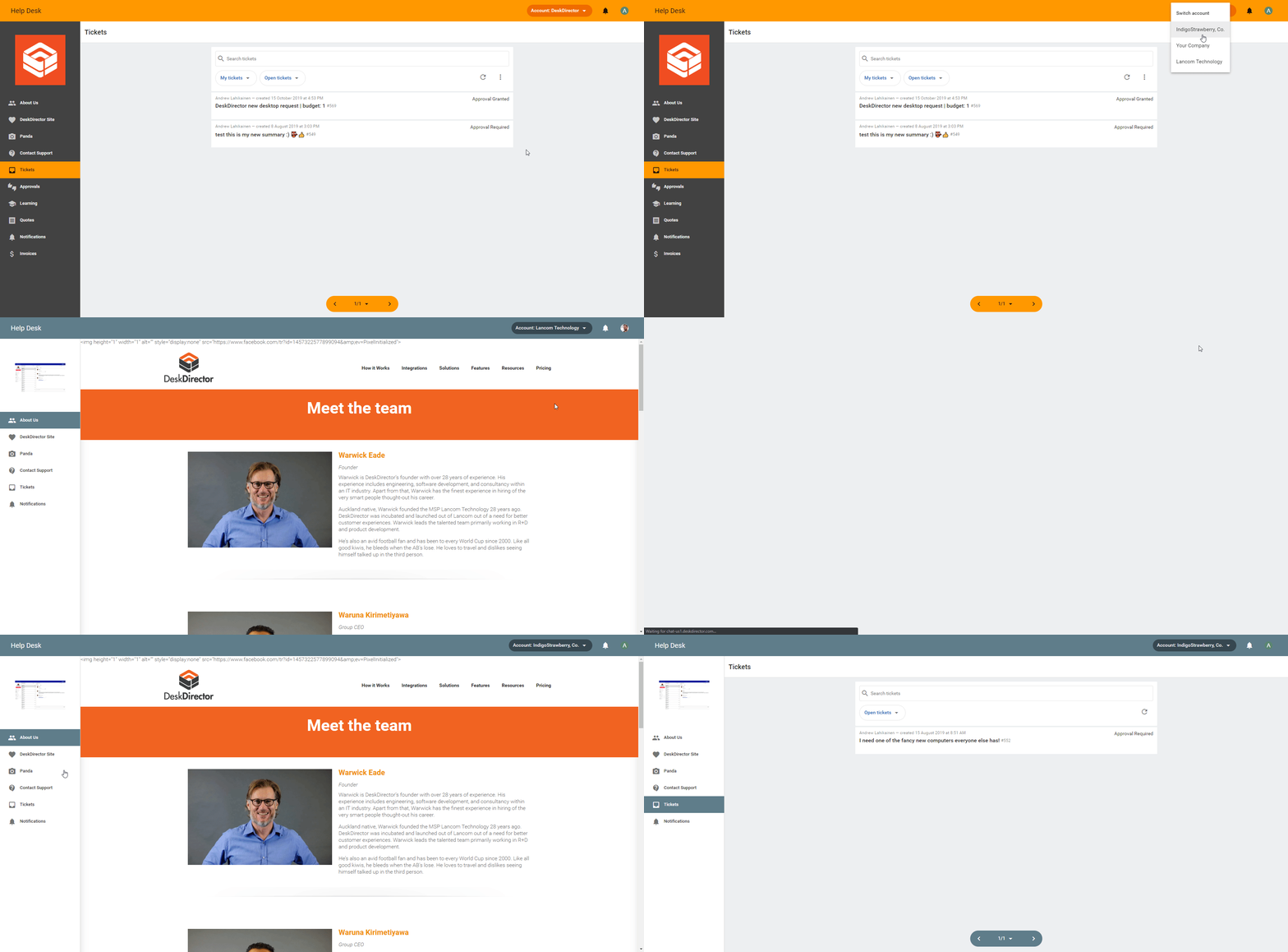
Account Switching
Portal users can now switch accounts so that they can view tickets from each company they belong to. Here's what it looks like in action:

Read more on our knowledge base here.
Notebook Menu Item
This is for those of you that use our OneNote integration - our new menu system now supports embedding a notebook right into the menu. This was possible with the legacy menu, however, the notebook had to be part of a learning category and was therefore always hidden away under the learning center. With the new menu system, you can reorder the menu items however you please. Here's our panda notebook shown as the third item in the menu:
You can read more about the menu system here.
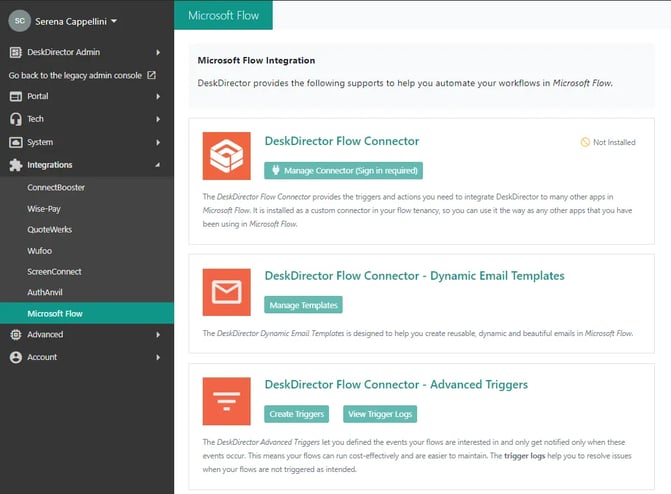
Microsoft flow integration for DD Dynamic customers
This is integration enables you to create your automated workflows in Microsoft Flow. Your flows can be triggered by ticket updates or chat status updates.

Improvements
Portal Ticket Note Adjustments
Notes inside the new ticket UI for Portal are now much more readable. The line height, letter spacing, margin, and font size have been tweaked.
Improvements to search
Previously we would split a search term into multiple tokens if it contained a special character. We now rely mainly on whitespace when tokenising a search term. We also now support wild card searches, so if you search for Desk* we will respect the wildcard character. We still automatically add the wildcard character for any search term that is 3 characters in length or longer.
Better Summary Editing in Portal
When an admin user (someone with all tickets or approval permissions, or the default contact) clicks the edit summary button in the new ticket UI, their cursor will automatically be placed at the end of the input
Improve New Tickets UI Responsiveness
The new tickets UI (tickets-v2) now displays better on smaller screens. Previously, information banners could bleed outside of their containers, and their text wouldn't wrap properly.
Fixes
- (Portal) Fixed an issue where tickets notes could bleed out of their contains if the note had a very long URL in it
- (ConnectWise) (Portal) Fixed an issue where tickets were being assigned to the API member if you had auto-assign member to tickets configured. We work around this issue after ticket creation by checking the member assigned to the ticket. If their licence class is API we remove them as the ticket owner.
- (Portal) Fixed an issue where default DeskDirector assets were being used for the logo and icon when adding the web portal to the home screen in Android
That’s all, folks!
In case you have questions, feel free to get in touch with us through our support portal or our Knowledgebase!


