You may have heard that our support team is moving from Zendesk to DD-Tech. This is awesome for our dev team because we get fast, consistent feedback and suggestions from our support team. This is awesome for you because you get features that are tried, tested, and bulletproof.
There are a few differences between how our support team operates and how an MSP operates. The most obvious being that we don't bill by the hour, and most of our support is centered on one software product. To fill this gap, we will be turning to our friends at Lancom for feedback. We also hope to receive suggestions on features that are essential to keep a tech productive and happy.
If you haven't heard of DD-Tech, you can read a bit of background in this post.
We've been quiet about DD-Tech for the last little while. This was due to a couple of reasons, the biggest being the release of the new Portal which required a lot of attention from our front-end team. This post marks the start of a series of monthly blog posts which will let you know what progress we've made on Tech.
What's new
Tickets Redesign
This month we re-designed every screen in Tech in response to feedback we were getting. Here is a link to the mock ups. The design we implemented this month was the ticket view.
Just in case you didn't read the DD-Tech blog above, here's what the ticket view used to look like:
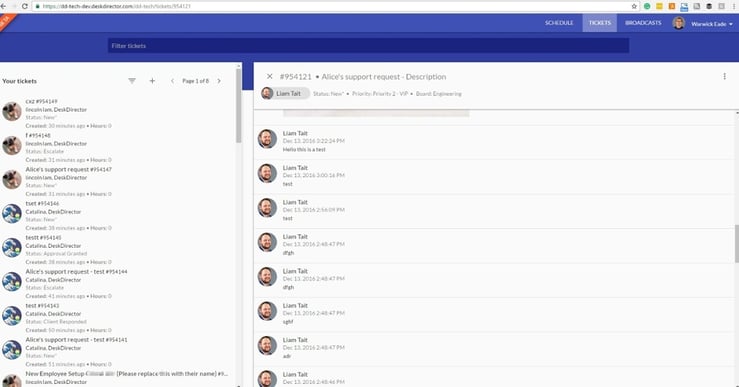
Not bad, but there are some usability issues. I won't go into too much detail here, I'll save that for a Design Discussion post. The main issue that stands out is that it is hard to parse the ticket list on the left hand side for details of a ticket. It's very hard to tell which company a ticket is from, for instance. Also, having a list + details design like this limits the amount of space on the ticket details view. While this works well in Portal, it's not well suited for DD-Tech since techs need to have access to a lot more information.
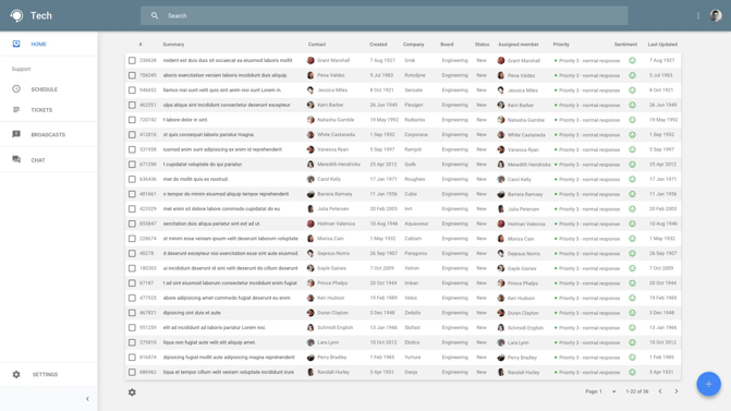
Here is the design for the ticket list:
And here is the implementation of the ticket view design (what you will see when you click a ticket):
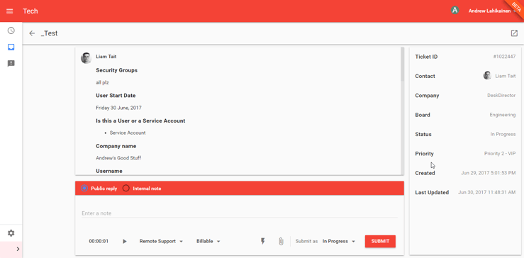
By switching to this design, we will free up a lot of space for additional information on a ticket. Already you can see there is a lot more information about this ticket immediately visible.
Macros
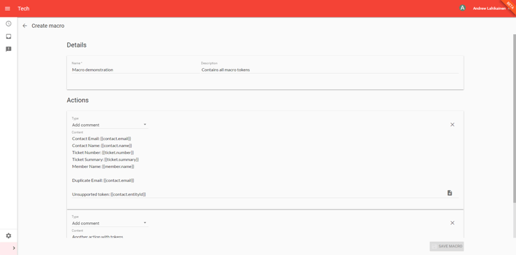
Ticket macros allow you to perform actions on a ticket. At this time there is one action you can perform; add a note to a ticket. This may not sound too exciting, but they can be useful as canned responses when combined with placeholder tokens. Let's take a look:
Creating a macro:
Supported Tokens:
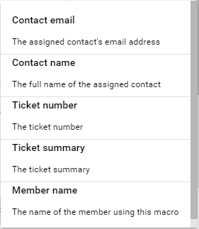
Here is a list of the supported tokens at the moment, let us know which tokens you would like to see:
Applying a macro
When viewing a ticket you can hit the lightning bolt icon to apply a macro:


Tokens get swapped out with the values from the ticket.
Other macro actions
We will be providing a webhook macro action which will allow you to post data to a url. You will be able to use this to trigger zapier/flow workflows, or even to post data to your own services.
Expect to see macros in mid July.


